A premium chocolate and gifting brand built around elegance, warmth, handcrafted details, and emotionally driven gifting moments.
Client:
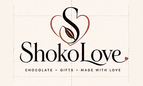
ShokoLove
Industry:
Chocolate / Premium Gifts
Date:
2026
Scope:
Brand Identity/ Packaging/ E-commerce/ Campaign/ Social Media/ Print/ Retail Display
ShokoLove was designed as a premium chocolate gifting brand where every touchpoint feels warm, elegant, and made to be shared.
Project Overview
Goal:
Create a refined chocolate brand that feels premium, giftable, romantic, and suitable for both everyday and seasonal collections.
Approach:
Develop a complete visual system across logo, packaging, product photography, web design, print, campaign assets, and retail touchpoints.
Outcome:
A cohesive brand world that can scale from individual chocolate bars to premium gift boxes, holiday editions, e-commerce, and in-store displays.
Brand Identity System
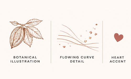
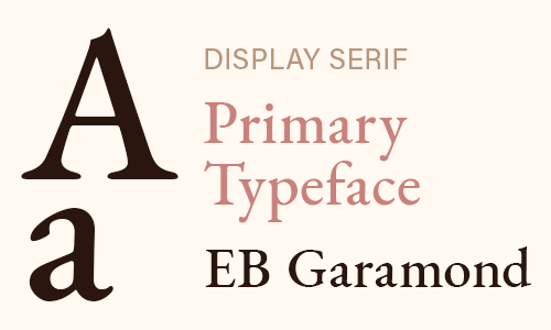
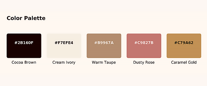
A Soft, Premium Identity System
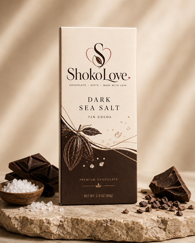
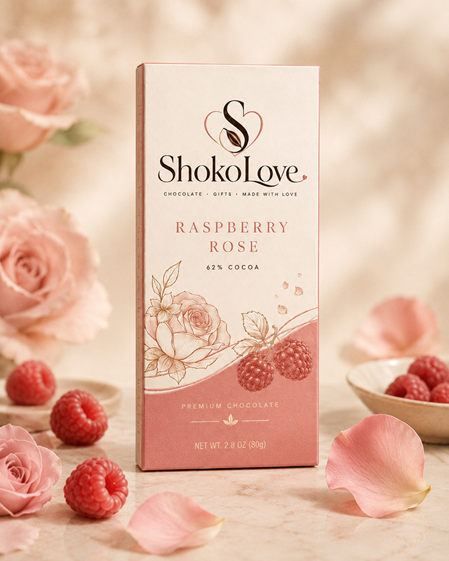
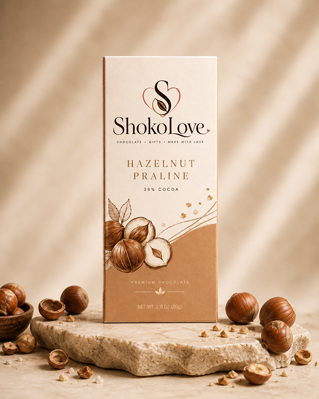
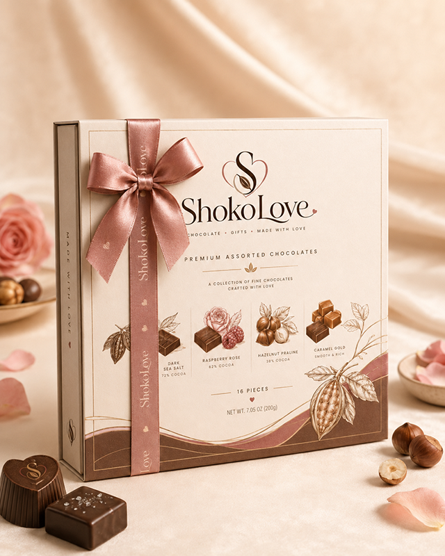
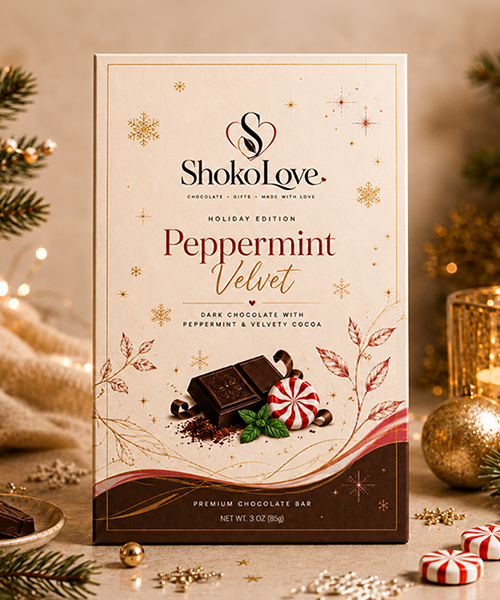
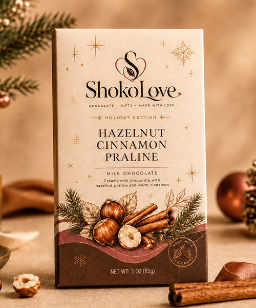
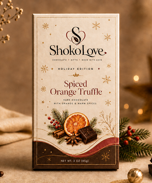
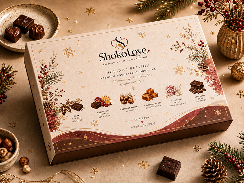
Core Packaging System
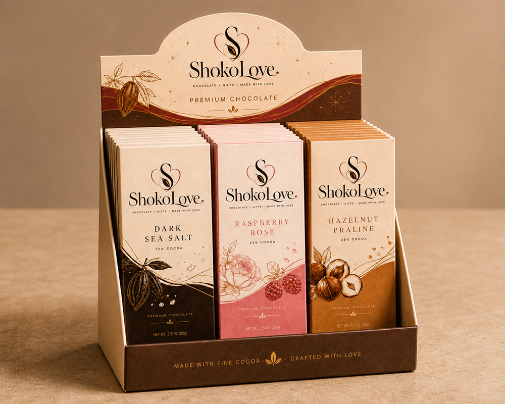
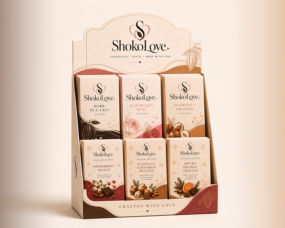
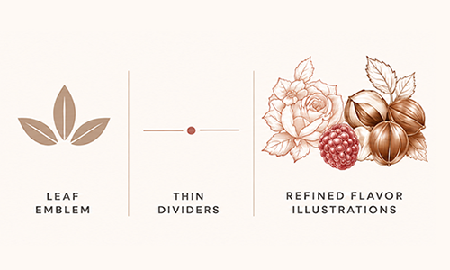
The packaging system uses warm ivory, cocoa brown, dusty rose, and delicate botanical illustrations to create a premium but approachable chocolate experience.
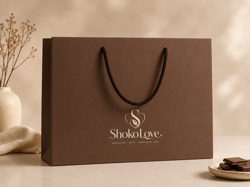
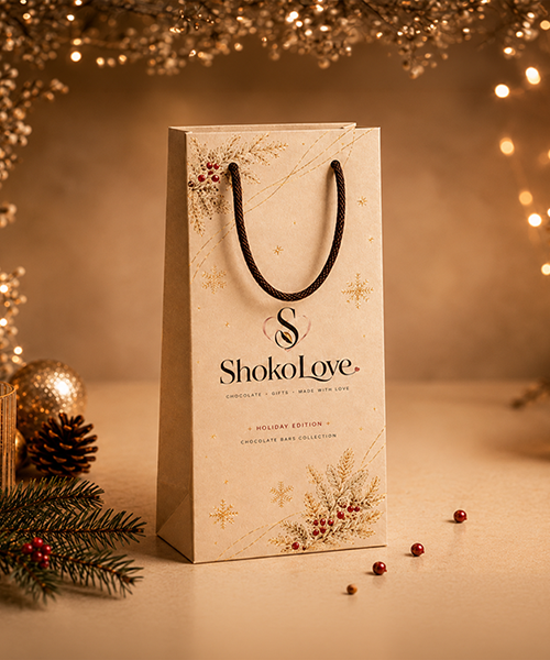
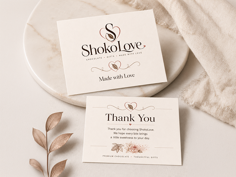
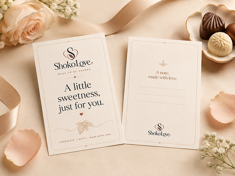
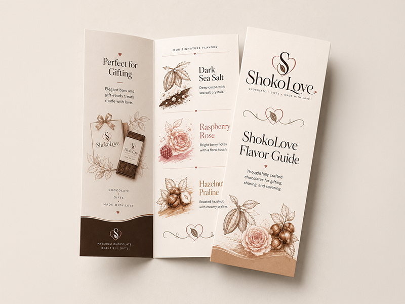
A curated set of printed touchpoints designed to extend the ShokoLove experience beyond the packaging. From thank-you cards and insert cards to flavor guides and gift bags, each piece reinforces the brand’s warm, premium, and gift-ready identity.
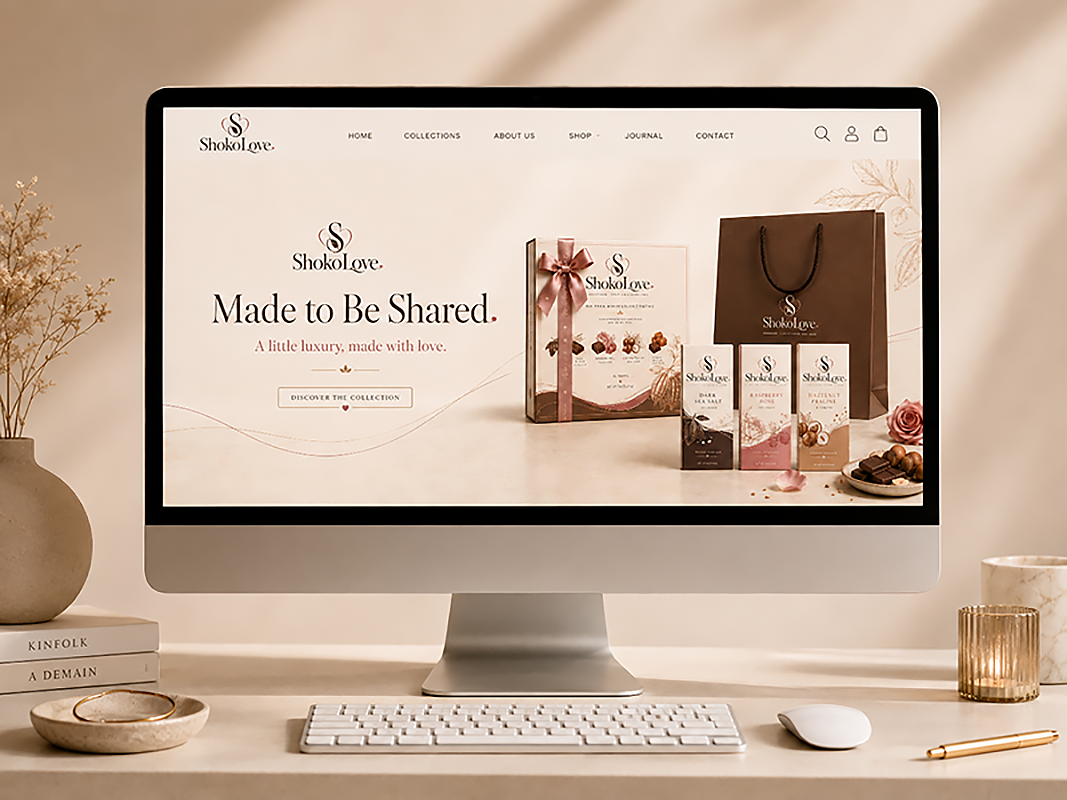
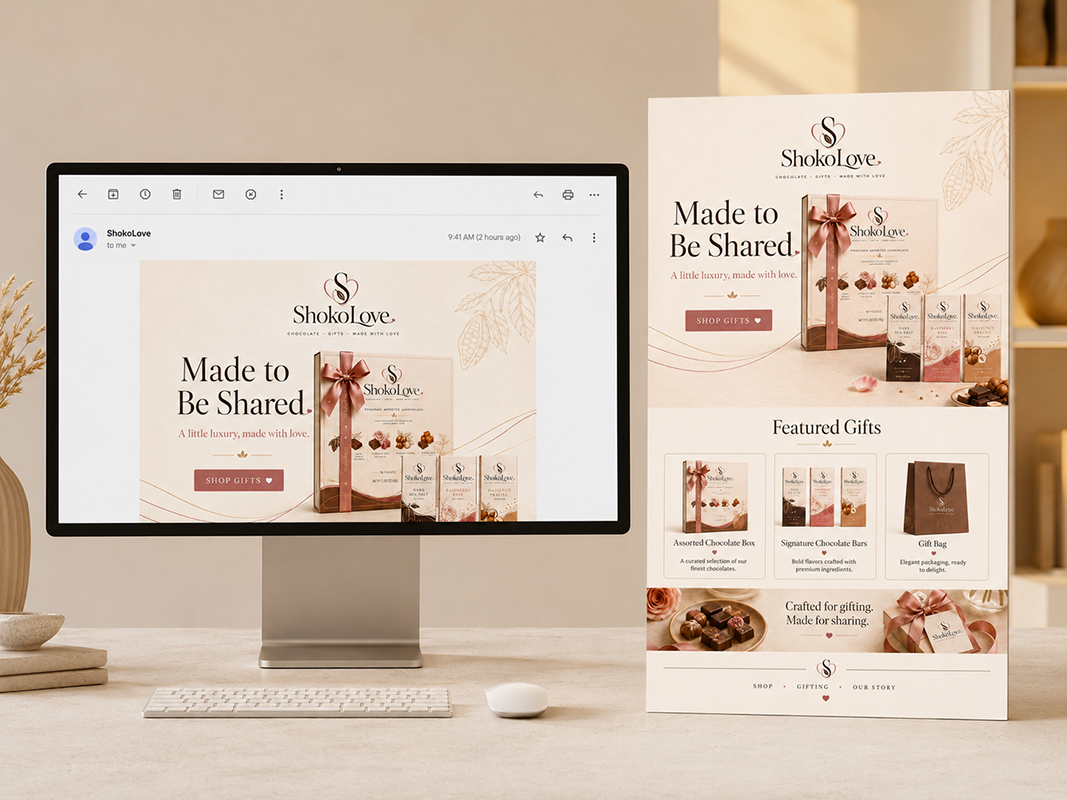
The digital experience extends the brand into a clean e-commerce system, helping shoppers explore core chocolates, seasonal editions, gifting options, and product collections with minimal friction.
Homepage Design
Shopping Experience
Product Hierarchy
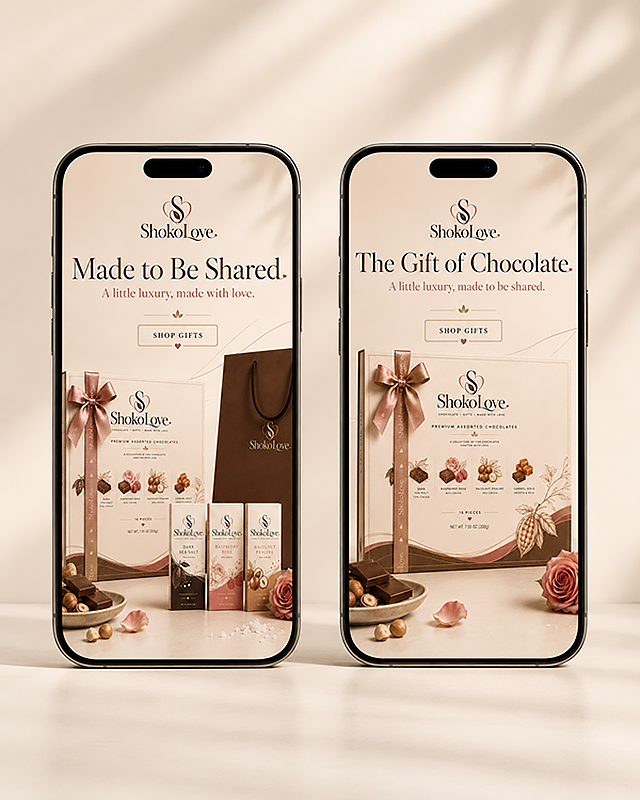
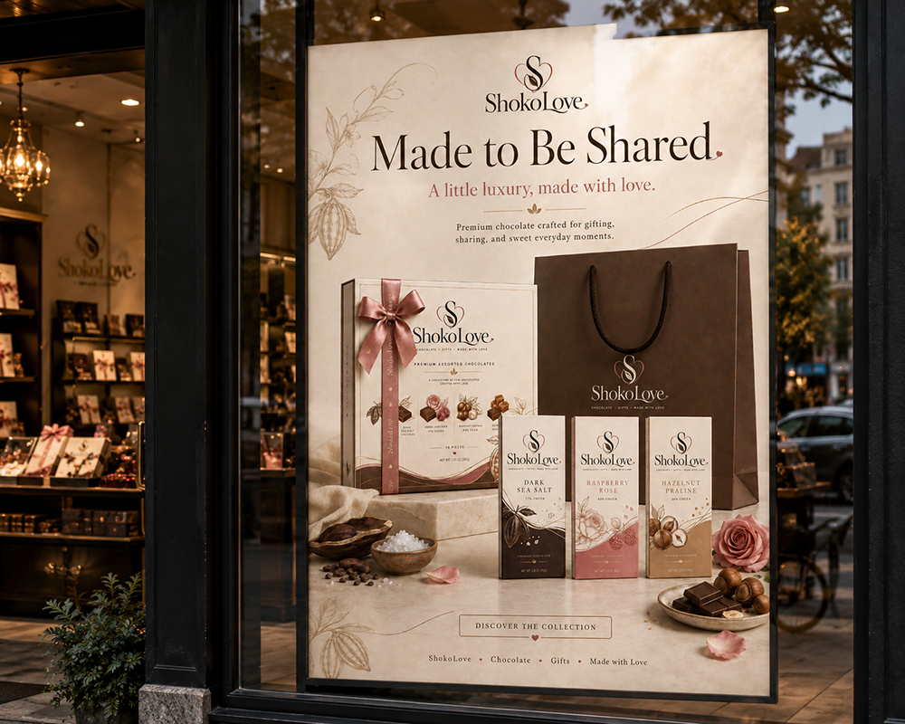
Campaign & Marketing Assets
The campaign assets build a consistent visual language across print, email, social, and web while keeping the brand emotional, minimal, and gift-focused.
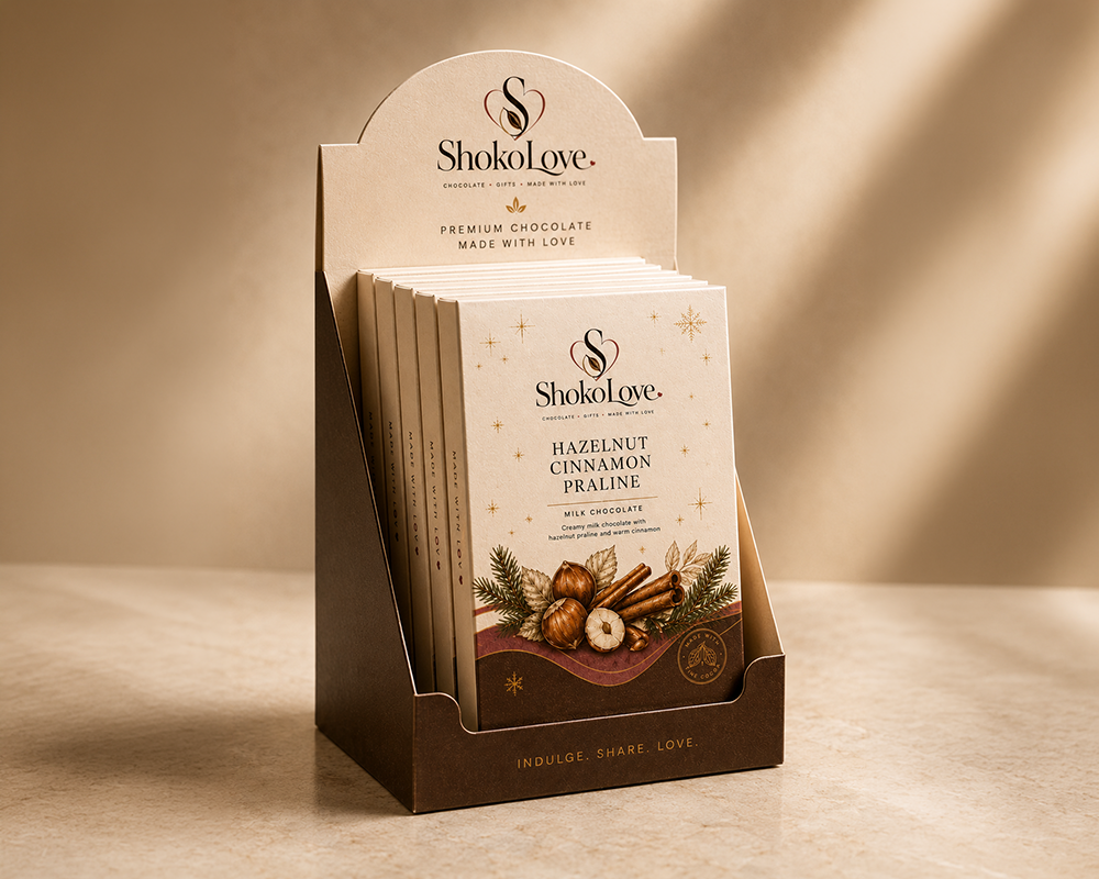
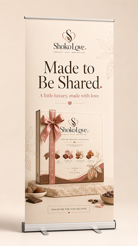
Retail assets were designed to support shelf presence, gifting moments, and in-store discovery while staying aligned with the premium packaging system.